I’m writing this post today to give you some recommendations as far as what color schemes I like for family photos! Choosing outfits can be one the hardest things you do after you book your photographer. Before you choose a color scheme, here are some things to consider:
- First, consider the location you’ll be at (You could also use your outfits to determine where you’ll go!)
- Second, what colors are in your home decor? If you’re going to make a large print of your family photo, I would make sure the colors you wear don’t clash with what is in your home
- Last, what season are the photos being taken in? Neutrals and dark tones can be beautiful in wintertime, greens and pinks during spring and summer, and neutrals and pops of burgundy and mustard in the fall.
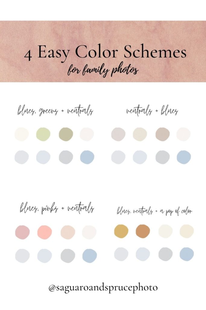
Four Color Schemes for Family Photos
Below are some of my favorite color schemes for family photos. I hope that these are somewhat helpful!
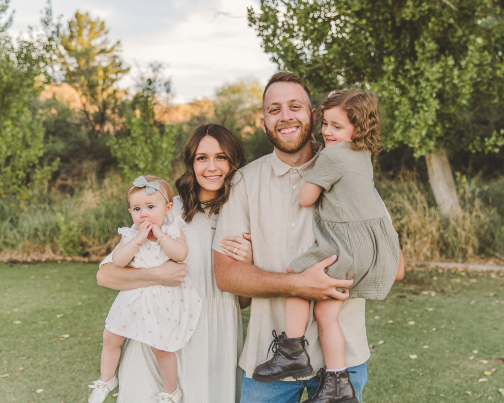
Neutrals and Blues (My go to Family Photos Color Scheme)
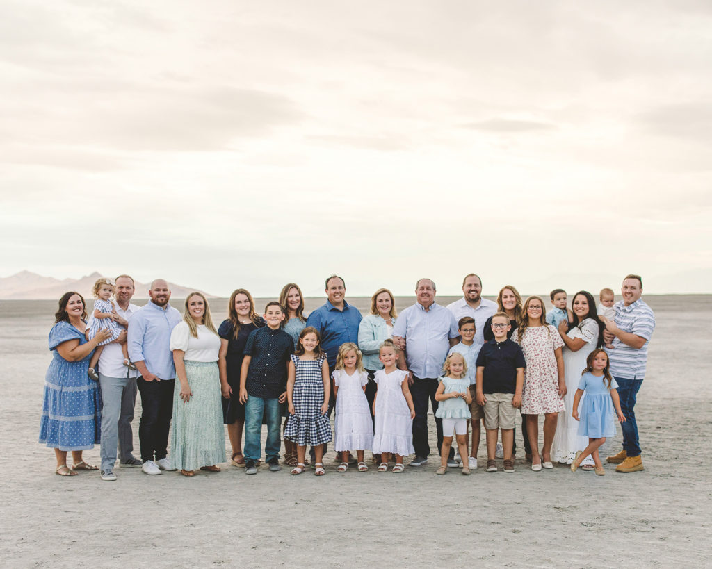
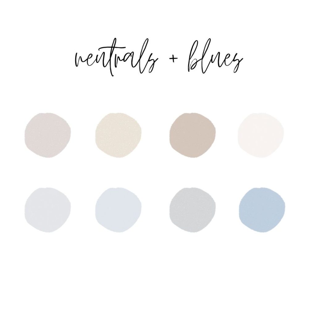
When in doubt, choose neutrals and blues. I especially love this combo for large groups. It can be hard to coordinate across many families, so this is a go-to for extended families. It also looks great on smaller families. I find that most of us already have lots of blue, white, and grays in our closets!
This color scheme is especially great for achieving that “beachy” look.
Blues and Pinks- Family Photos Color Scheme #2
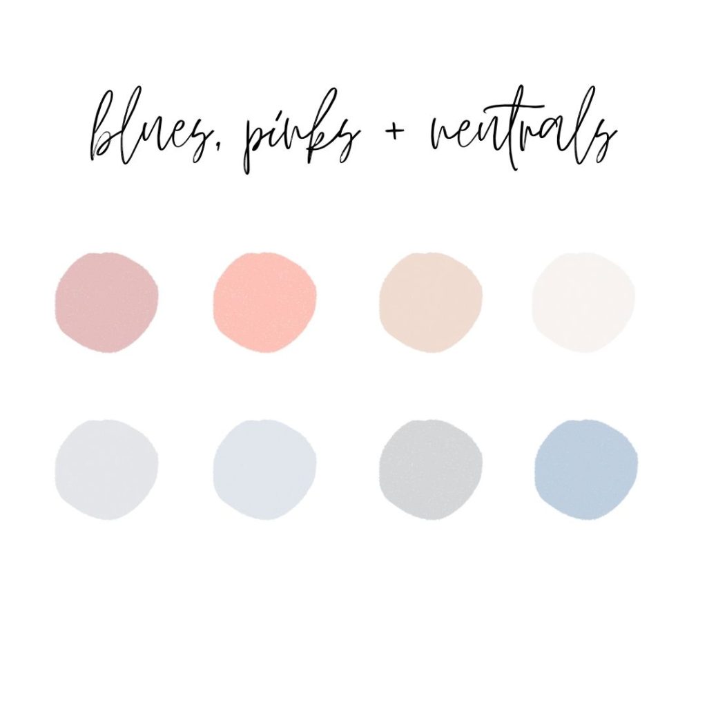
I have to admit that this may be my favorite color palette. Personally, I LOVE a soft pink with denim, white, and blues. I love how the pink looks so dreamy in my editing and I will never shy away from suggesting this color scheme to clients.
Greens, Blues, and Neutrals
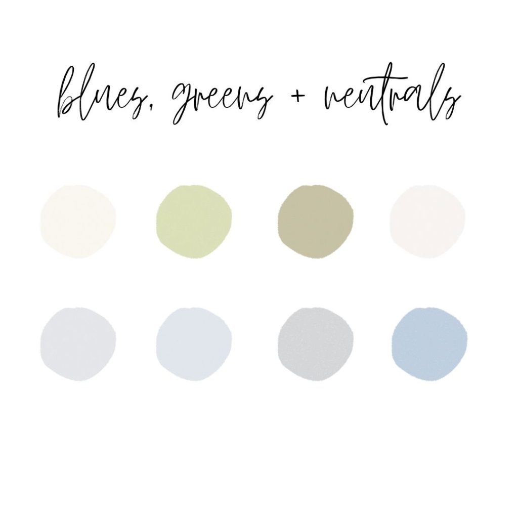
This color scheme is also good. I love adding in some green! Try keeping your greens more on the “earth tone” side of things rather than bold greens. I always love a soft shade of green!
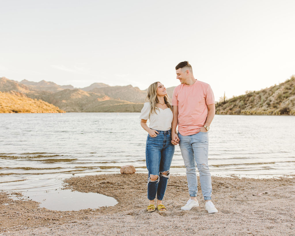
4. A Pop of Color, Blues, and Neutrals
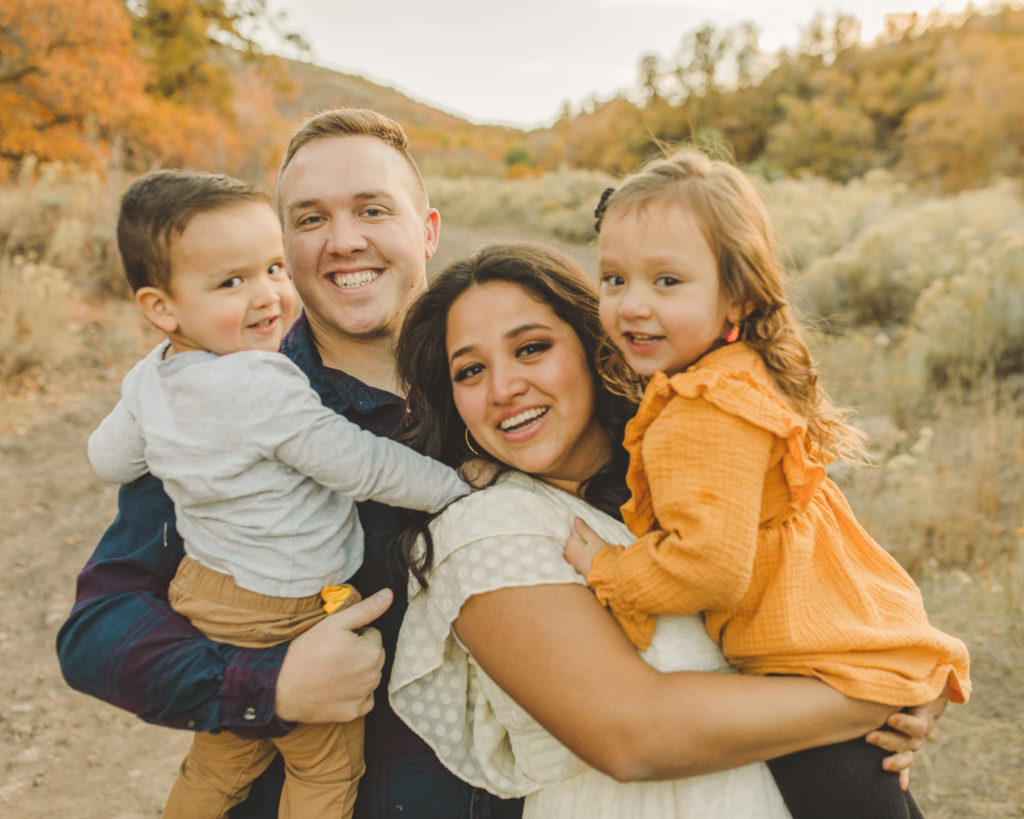
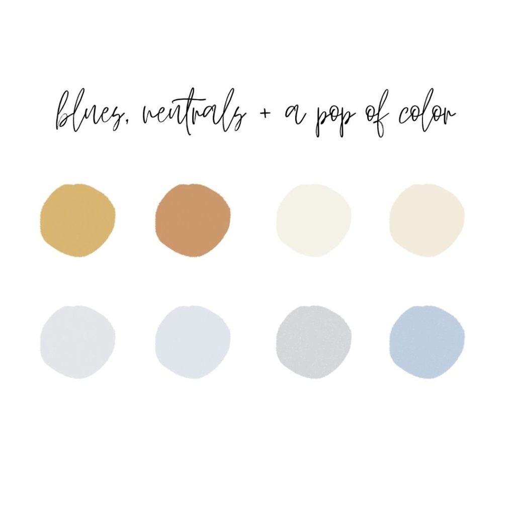
If you’re like me, you love color! The thing is, YOU should be the centerpiece of your family portraits, NOT what you’re wearing! Having too many bold or accent colors can be a little distracting and take away from you. If you’d like to add in a bold color, I’d stick to one for small families (up to 5 people) and maybe 2 colors for larger families (6+ people)
Arizona Family Photographer
If you’re looking for an Arizona (or Utah) family photographer, I’d love to work with you! Capturing families is one of my most favorite things to do! Click here to read more about my family sessions. Once you’re ready to book, send me an inquiry here.
I hope this post was a little helpful! I know choosing a color scheme for family pictures can be extremely stressful. Take deep breaths and ask your photographer for help if you need it ❤️
xoxo,
Nicole